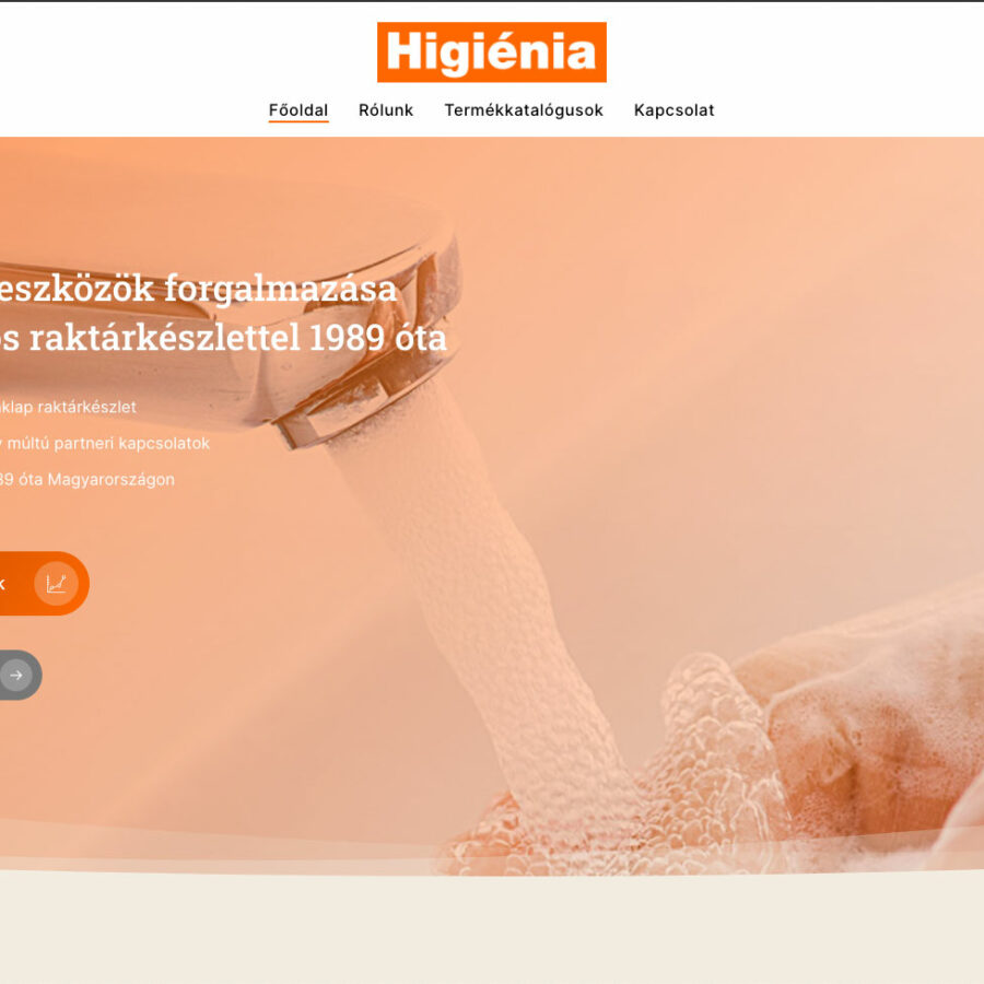
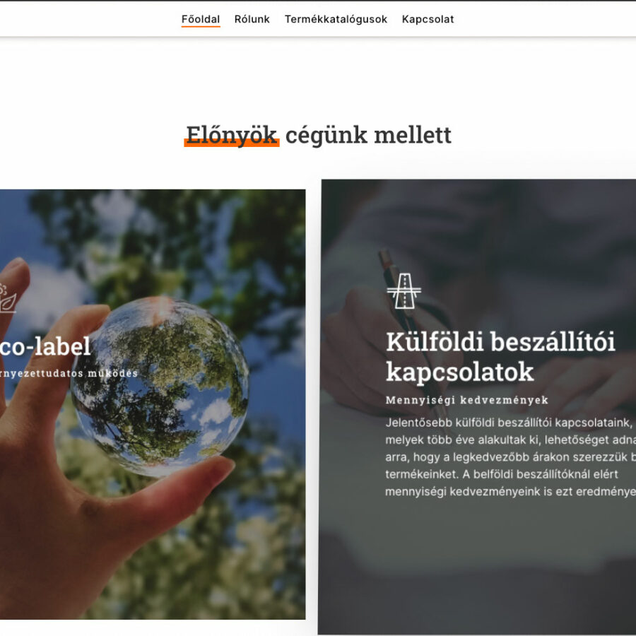
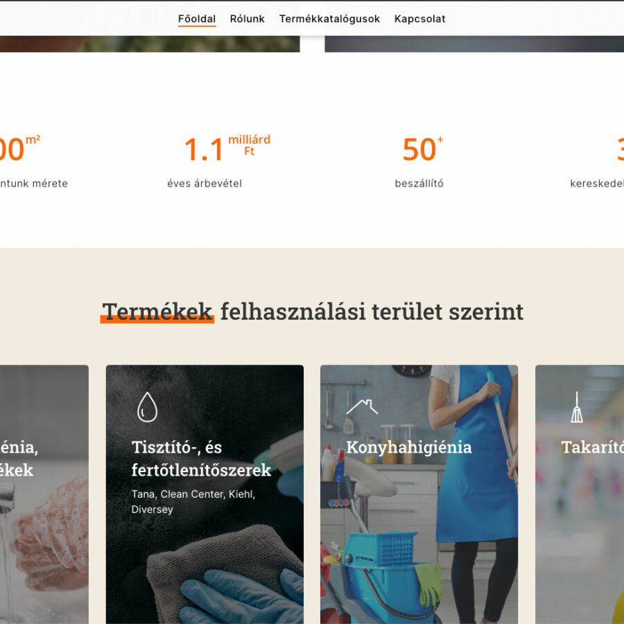
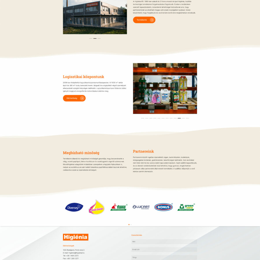
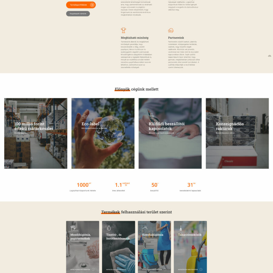
I had to refresh and redesign an old, outdated website. I received the order from a representative of Higiénia Ltd. The project started at the end of last year, when it was still an online store, then it turned out that it was a wholesaler, so I had to create an impressive portfolio site.
I also had to do the DNS modification of the domain name, since the A record pointed to a place that no longer worked, so I also provided the hosting.
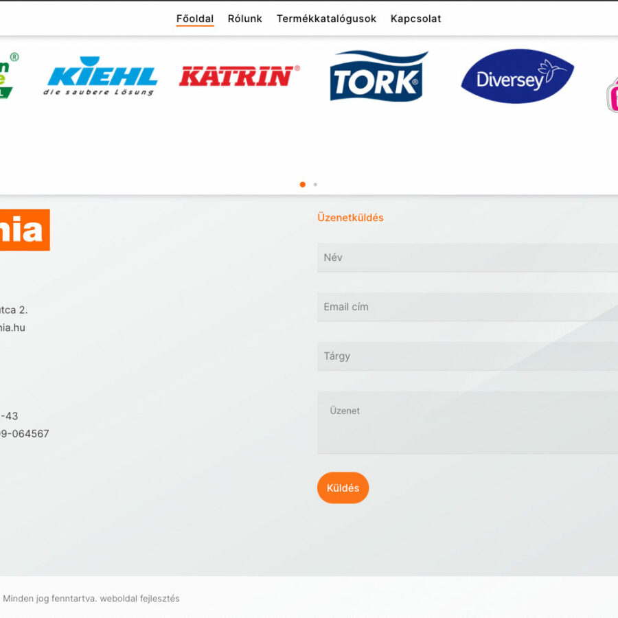
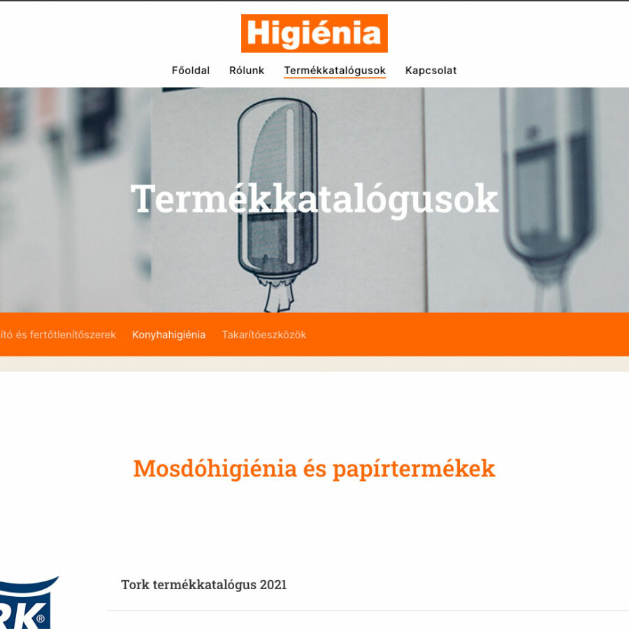
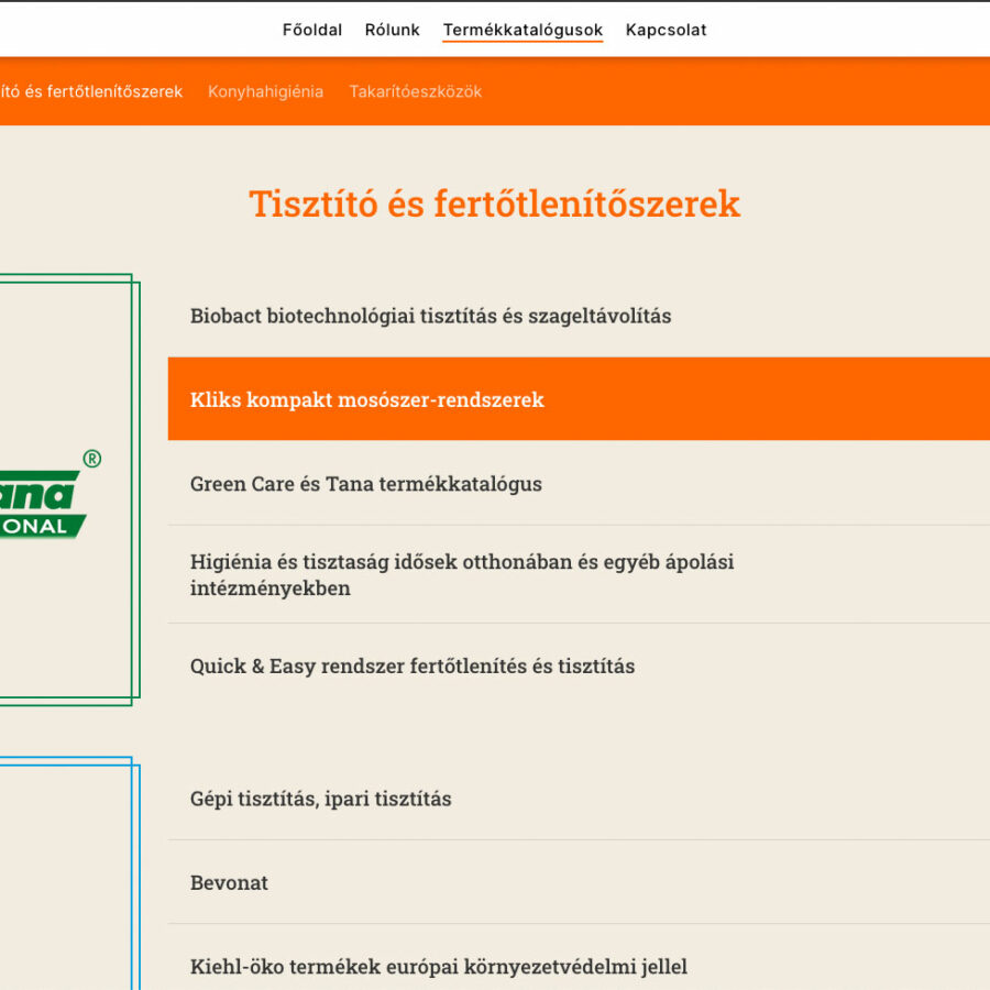
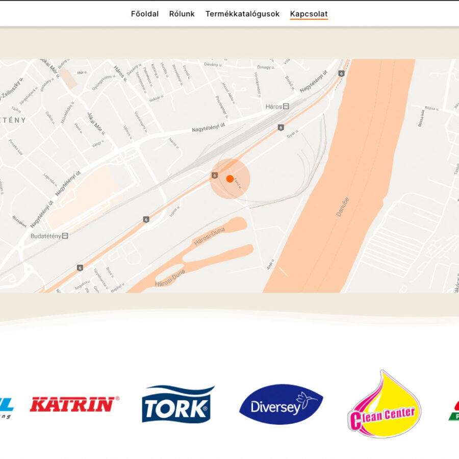
First, a small logo adjustment was needed, such as equalizing the typeface, correcting letter spacing and distorted letters. After that, I took the photos and texts from the old but still working website, and then we rewrote and updated it together with the company. The website has a total of 4 sections, the homepage, an introduction section, the catalog download section and the contact menu with an interactive Google Maps and an automated form.
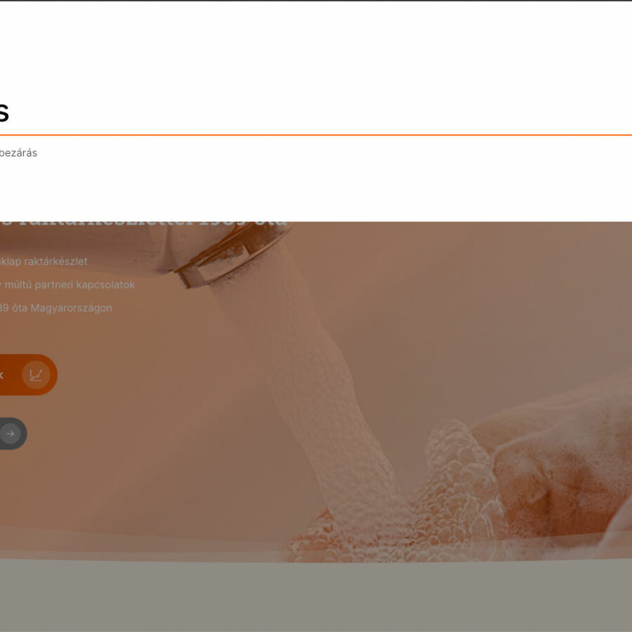
Because there was not a lot of content, I boosted the look of the page with a lot of small movements, special menu animations and hover effects. Although the function of the premium template was a given, I had to touch it in many places (especially in the mobile version) to make the size and location of the letters consistent. Overall, it turned out to be a clean, transparent website.


